Computer Station Nation is reader-supported.
When you buy through links on our site, we may earn an affiliate commission. Learn more.
Quick picks
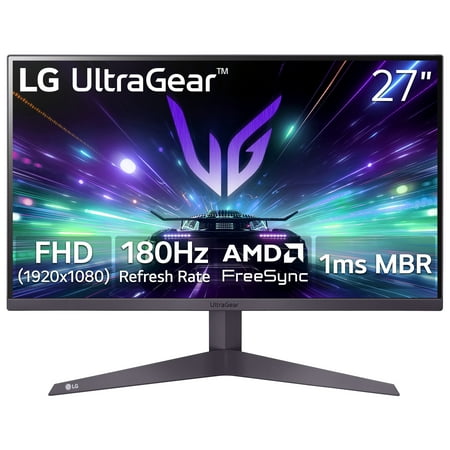
- Best overall for design: LG 27″ UltraGear FHD 180Hz — 27″ IPS at 180Hz, best all-rounder for design + gaming
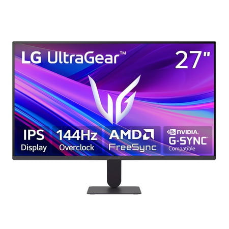
- Best value 27″ IPS: LG 27″ UltraGear FHD 144Hz — same LG panel, $50 cheaper, 144Hz instead of 180Hz
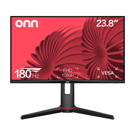
- Best budget 24″: onn 24″ FHD 180Hz FreeSync — fastest refresh at the budget tier
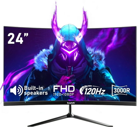
- Best curved budget: Gawfolk 24″ Curved 120Hz — curved IPS under $120
- Solid office + casual design: onn 24″ FHD 100Hz — no-frills IPS for light creative work
- Cheapest option: onn 22″ FHD 100Hz — IPS at $79 for tight budgets
Selection methodology: For graphic design, IPS panel type is the baseline requirement — better color accuracy and wider viewing angles than TN or VA. I looked at monitors available at Walmart prioritizing IPS panels, 27″ sizes where possible (more workspace), and color-relevant specs. For serious professional color work, you’ll want a dedicated wide-gamut monitor (Dell UltraSharp, BenQ SW series) — these picks are for designers who also game or do casual creative work on a budget.
Introduction
If you’re doing graphic design, photo editing, or any visual creative work, your monitor choice matters more than for pure gaming. You need accurate colors. IPS is the panel type to target — better color reproduction and viewing angles than TN, and better response times than VA.
The good news: IPS panels have gotten cheap. You can get a solid 27″ IPS at under $140 now. The LG UltraGear line offers genuine IPS quality at budget prices.
Honest caveat first: if your work is professional and color-critical — print production, photography, video color grading — these monitors won’t cut it. You need a wide-gamut IPS with hardware calibration (Dell UltraSharp or similar). But if you’re a designer who also games, or you do casual creative work and want a monitor that handles both, these picks cover that middle ground well.
For a full rundown of monitor specs, see our gaming monitors complete guide.
At a glance
| Monitor | Best for | Size | Refresh rate | Panel | Price |
|---|---|---|---|---|---|
| LG 27″ UltraGear 180Hz | Best overall | 27″ | 180Hz | IPS | $139 |
| LG 27″ UltraGear 144Hz | Best value 27″ | 27″ | 144Hz | IPS | $89 |
| onn 24″ FHD 180Hz | Budget speed | 24″ | 180Hz | IPS | $99 |
| Gawfolk 24″ Curved | Budget curved | 24″ | 120Hz | Curved IPS | $119.99 |
| onn 24″ FHD 100Hz | Office + design | 24″ | 100Hz | IPS | $91 |
| onn 22″ FHD 100Hz | Cheapest IPS | 22″ | 100Hz | IPS | $79 |
Contents
LG 27″ UltraGear FHD 180Hz — best overall
The LG 27" UltraGear Gaming Monitor (27GS40W-B) delivers a high-performance 180Hz refresh rate combined with AMD FreeSync™ technology to minimize screen tearing and ensure fluid motion. Its 3-side virtually borderless design provides an expansive viewing experience with a clean, modern...
| Spec | Value |
|---|---|
| Size | 27″ |
| Resolution | 1920×1080 (FHD) |
| Refresh rate | 180Hz |
| Panel | IPS |
| Sync | AMD FreeSync |
| Price | $139 |
Rating: 4.5/5
The LG 27″ UltraGear FHD at $139 hits the sweet spot for designer-gamers. 27″ gives you real screen real estate for creative work — editing, layout, illustration. IPS panel means colors are accurate and you can see them properly from any angle. 180Hz means games feel smooth and the display handles fast motion without artifacts.
LG’s factory calibration on their UltraGear IPS line is consistently good. You get accurate-ish colors right out of the box without needing to mess with settings. AMD FreeSync keeps gameplay tear-free.
Pros: 27″ workspace, genuine LG IPS quality, 180Hz for gaming, FreeSync compatible
Cons: 1080p at 27″ is softer than 1440p — noticeable in detailed design work; no hardware calibration
LG 27″ UltraGear FHD 144Hz — best value 27″
Upgrade your setup with this 27-inch Full HD IPS monitor made for work and play. See bright colors, wide angles, and a borderless screen for easy multi-monitor use. Enjoy smooth gaming with 144Hz, 1ms response, and AMD FreeSync and G-Sync Compatibility. Black Stabilizer and Dynamic Action Sync...
| Spec | Value |
|---|---|
| Size | 27″ |
| Resolution | 1920×1080 (FHD) |
| Refresh rate | 144Hz |
| Panel | IPS |
| Sync | AMD FreeSync, G-Sync Compatible |
| Price | $89 |
Rating: 4.4/5
Same LG UltraGear IPS quality, $50 less, 144Hz instead of 180Hz. For design work, the difference between 144Hz and 180Hz is irrelevant — you care about color accuracy, not frame rate. This is the better value pick if you’re using the monitor primarily for creative work with gaming as secondary.
At $89 for a 27″ LG IPS panel, this is genuinely hard to beat. G-Sync Compatible means it works with NVIDIA GPUs too.
Pros: $89 for 27″ LG IPS is exceptional value, G-Sync Compatible, real IPS color quality
Cons: 144Hz vs 180Hz isn’t a real downgrade for design use; 1080p resolution is the actual limitation at 27″
onn 24″ FHD 180Hz FreeSync — best budget speed
The onn 24" FHD Gaming Monitor is a high-performance display designed for gaming enthusiasts. With a 24" (23.8" actual diagonal) screen size, it boasts a 1920 x 1080p resolution, providing a crisp and clear Full High Definition (FHD) visual experience. The monitor's 180Hz refresh rate and 1ms...
| Spec | Value |
|---|---|
| Size | 24″ |
| Resolution | 1920×1080 (FHD) |
| Refresh rate | 180Hz |
| Response time | 1ms |
| Sync | AMD FreeSync |
| Price | $99 |
Rating: 4.0/5
onn is Walmart’s house brand. Not glamorous, but a 180Hz 1ms FreeSync monitor at $99 is genuinely useful hardware. The IPS panel handles color well enough for casual design work. For someone who mostly games and occasionally does creative projects, this gets the job done without spending much.
Pros: 180Hz at $99, FreeSync, 1ms response time, solid specs for the price
Cons: onn brand build quality is hit or miss; 24″ is smaller than ideal for design work; no prestige factor
Gawfolk 24″ Curved Gaming Monitor 120Hz — best curved budget
Gawfolk 24-Inch Curved Gaming Monitor in excellent condition features a 3000R curvature for immersive viewing. The monitor boasts a VA panel with a Full HD 1920x1080p resolution and a 120Hz refresh rate, ensuring smooth and vibrant visuals. With a 5ms response time and a dynamic contrast ratio...
| Spec | Value |
|---|---|
| Size | 24″ |
| Resolution | 1920×1080 (FHD) |
| Refresh rate | 120Hz |
| Panel | Curved IPS |
| Price | $119.99 |
Rating: 4.0/5
Curved IPS under $120. Some designers prefer a curved screen for reducing eye strain over long sessions — the slight inward curve means less eye travel across the full width of the display. At 24″ the curve is subtle, but it’s there. 120Hz is fine for this use case.
Gawfolk is a newer budget brand. Check current reviews before buying — product quality from newer brands can vary between batches.
Pros: Curved IPS at a low price, decent specs for design + casual gaming
Cons: Newer brand, less track record than LG; 24″ curved is subtle — upgrade to 27″+ for a more meaningful curve experience
onn 24″ FHD 100Hz — office + design utility
| Spec | Value |
|---|---|
| Size | 24″ |
| Resolution | 1920×1080 (FHD) |
| Refresh rate | 100Hz |
| Panel | IPS |
| Price | $91 |
Rating: 3.8/5
The slower sibling to the 180Hz onn. 100Hz is plenty for design work — you’re not gaming at 180fps in Photoshop. IPS panel, $91 price tag. If you’re primarily a creative and barely game, you don’t need to pay for 180Hz. This works.
Pros: IPS panel at a low price, 24″ is workable for design, no-frills utility
Cons: 100Hz shows its limits in gaming; onn brand variability; for $8 more you can get the 180Hz version
onn 22″ FHD 100Hz — cheapest IPS option
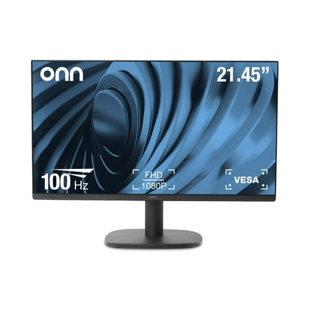
The onn 22" FHD Monitor is a high-quality display that offers Full High Definition performance in a 22-inch FHD Monitor with a bezel-less display and adjustable stand. With a 22" (21.45" actual diagonal) 1080p Monitor, it features a 1920 x 1080p Resolution, providing a clear and crisp image. The...
| Spec | Value |
|---|---|
| Size | 22″ |
| Resolution | 1920×1080 (FHD) |
| Refresh rate | 100Hz |
| Panel | IPS |
| Price | $79 |
Rating: 3.6/5
The cheapest IPS on the list. 22″ is small by 2026 standards — design work on 22″ is a bit cramped. But if budget is the absolute constraint and IPS panel quality matters for your work, this gets you in the door.
Pros: IPS at $79, works for light design tasks
Cons: 22″ is too small for comfortable extended design sessions; spend $10 more for the 24″ version
Verdict
For the designer-gamer who needs one monitor for everything, the LG 27″ UltraGear 144Hz at $89 is the pick. 27″ IPS from LG at that price is genuinely hard to argue with. If you want the slightly faster panel, step up to the 180Hz version at $139.
If you’re purely a casual creative with light gaming needs, the onn 24″ 100Hz at $91 does the job without paying for refresh rate you won’t use.
If you ever plan to do serious color-critical work, budget $300+ for a dedicated wide-gamut IPS (Dell UltraSharp, BenQ PD series). These picks are honest about their limitations for professional color work.
Frequently asked questions
Do I need a special monitor for graphic design?
Depends on the work. For casual design, social media graphics, basic photo editing — a good IPS monitor like the LG UltraGear works fine. For professional color work (print production, commercial photography, video grading) you need a wide-gamut monitor with hardware calibration. The picks here cover the casual-to-prosumer range, not pro color work.
Is IPS necessary for design work?
Yes, for any serious creative use. IPS panels have better color accuracy and wider viewing angles than TN panels. VA panels have better contrast but viewing angles shift color slightly. Stick with IPS for design. All the picks on this list are IPS.
Why isn’t 4K on this list?
4K monitors for graphic design are excellent but pricy. None of the Walmart options at budget prices returned a 4K monitor for this keyword. For 4K design monitors, you’re looking at $300+ from Dell or BenQ. The LG 27″ at 1440p (not on this list but available separately) would be the ideal upgrade step.
Can I use a gaming monitor for photo editing?
Yes, with caveats. Gaming IPS monitors cover sRGB color space well. Most casual photo editing uses sRGB. If you need wide color gamut (P3, AdobeRGB) for professional work, dedicated creative monitors are the better choice. For Instagram-level work and hobby photography, a good gaming IPS is fine.

